⚽Comunio | Full product redesign for a football fantasy platform
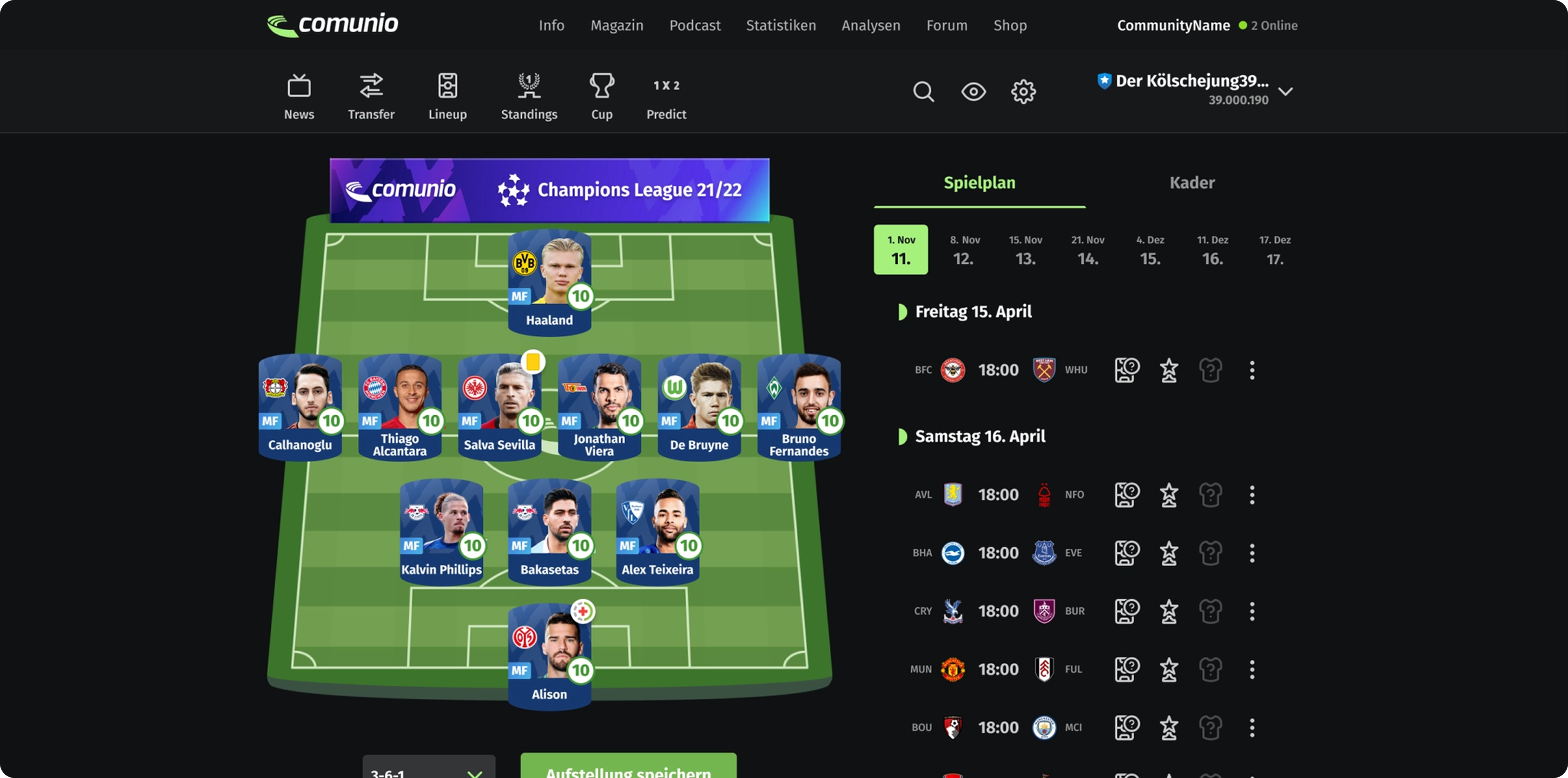
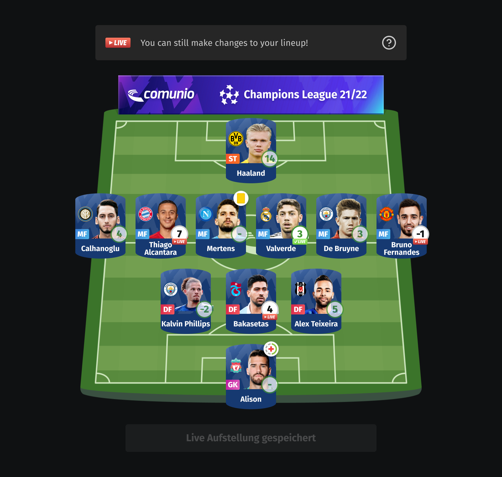
Comunio is a long-running football fantasy platform with an established user base and a highly loyal fanbase. I was tasked with redesigning all the experience, renewing structure, navigation and interface patterns to make the product clearer, more modern and more cohesive. The goal was not just a visual refresh, but a complete product redesign that balanced usability and modernizing with familiarity at the base of a long-time loyal users.

🧗The Challenge

Over time, Comunio had become harder to navigate and less consistent across key areas. The interface felt dense, many screens were visually dense, and the overall experience lacked a clear and unified structure. The challenge was to modernize the product while keeping it familiar to the users who already relied on it.
🚨Key Issues
Visual
Outdated visual language, inconsistent UI patterns across platforms
UX
Dense screens with poor scan and navigation, structural complexity across screens
Product constraints
Preserve familiarity for existing users, minimize disruption during transition
🎯Design Goals
The goal was simple in words: refine the interface, but create a clearer and more cohesive product experience. The redesign aimed to balance usability, simplicity and clarity, making sure communities can feel confident while keeping it familiar to the users who already relied on it.
- •Modernize the overall product experience
- •Improve clarity and reduce UI noise
- •Preserve familiarity for existing fans
- •Create a shared cross-platform foundation
- •Improve discoverability and navigation
- •Enable continuous data-driven iteration
🦸My Role
I led the redesign of Comunio across product and brand touchpoints, shaping a more modern and cohesive experience for a long-running fantasy football platform. The result was brand-new interface improvements, introduced a refreshed visual direction, navigation and usability across the product, refreshing Comunio's visual identity across web, iOS, mobile and social media, and contributed to the creative direction for new game features.
- •Full product redesign ownership
- •UX architecture of a new feature backlog across web, iOS and Android
- •Information architecture refinement and tested usability across key flows
- •Extended the redesign beyond the product into social media
- •Contributed to the conception and blueprint of new game features
- •Collaborated closely with developers to bring the redesign into production
✨Design Approach
Rather than treating the project as a simple UI refresh, I approached it as a broader product redesign grounded in research and iterative validation. I started by analyzing the existing experience through user research and insight collection to understand where structure, usability and visual consistency needed work.
This informed the definition of a clearer product direction, which I explored through low-constraint information architecture work and early testing with users.
Modules such as card sorting helped shape navigation decisions, while ongoing feedback and testing supported the refinement of flows, screens and interaction patterns across web and mobile.
Throughout the process, design decisions were continuously balanced with implementation realities.
🧩Key Steps
Audit
Audited the existing product experience and visual consistency
Identify
Identified structural, usability and visual consistency issues
Concepts
Developed concept directions with more button-moving into final
Principles
Established a design language and direction
Apply
Applied the new direction across core flows and patterns
Iterate
Iterated closely with developers throughout implementation
⭐Key Design Decisions
Navigation & Information Architecture
Simplified navigation structure and reorganized content to improve discoverability and reduce complexity.
Cohesive Visual System
Introduced a more consistent visual language across web, iOS and Android.
Simplifying Dense Screens
Reduced visual hierarchy, improved scannability and made the information easier to parse.
Expanding the Product Experience
Explored micro-gamification and engagement concepts beyond the existing platform features.
⚡Outcome
A more modern, cohesive and scalable experience across Comunio's multi-platforms.
Full redesign across platforms
Unified experience across web, iOS and Android
Simplified navigation & usability
Cleaner structure, reduced navigation and interaction complexity
More cohesive visual system
Stronger hierarchy, spacing and typographic discipline
Modernized without disruption
Improved the experience while preserving familiarity
Foundation for future evolution
Created a more scalable product structure and expanded the experience through new features


👨🎓Learnings
What made this project especially interesting was the need to balance product vision with familiarity. Redesigning a live product with established users often feels expected more than a visual improvement. It needs refreshing choices, navigation and consistency without upsetting users who already trusted it. For me, it was a valuable exercise in combining research, systems thinking and creative evolution in a highly constrained yet meaningful space.